vector fields : the start

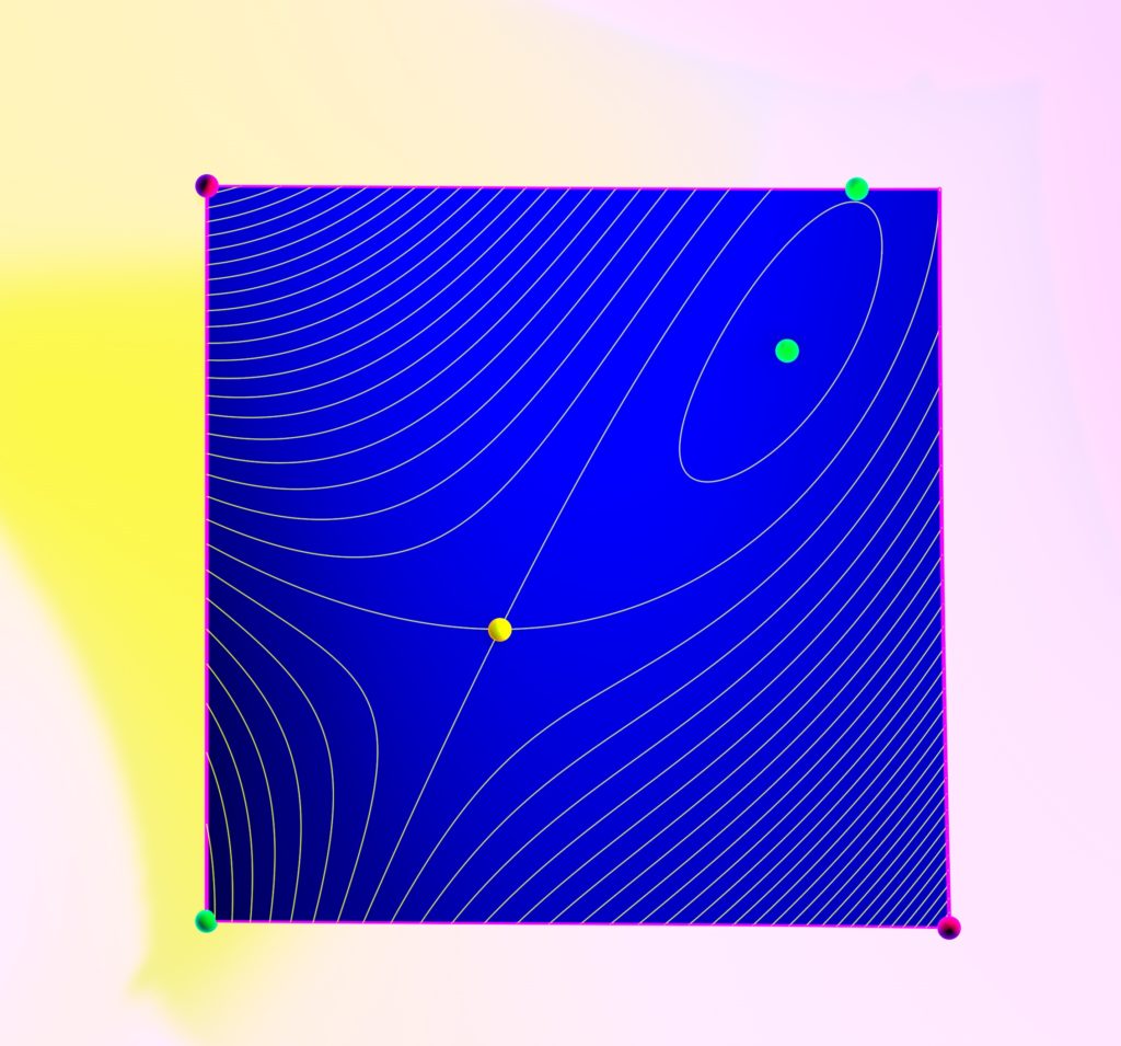
oh boy… this is going to be a frequent topic. i *hate* how vector fields are drawn. i don’t believe i’ve ever seen a vector field drawn well. ever. why? [hello matlab, mathematica, et al…]

  1. square grid sampling: yuk.
  2. non-adaptive sampling: too few samples near equilibria & too many where the vectors are large
  3. long vectors intersect: yuk.
  4. the arrows are drawn poorly. also, yuk.
  5. no/poor use of color.
  6. static pics — vector fields should induce flow (in your mind)

can i fix all these problems? hardly. not easily. but i’m trying. here’s an early attempt. it, too, is flawed. but notice the difference that a hex grid, a bit of style on the arrows, a little 3-d layering, and some ambient occlusion make.

BLUE 4 PROLOGUE : an early attempt at a vector field. ahhh…

soft shadows

this overhead still from BLUE 2 chapter 17 is a decent effort: the soft shadow maps on the base plane are warm & undistracting. the contrast between the surface shader and the contour lines is also a win. when animated, this is not bad.

BLUE vol 2 chapter 17 : extrema, contour lines, and a soft shadow

a simple surface…

here’s an early picture that i drew for BLUE vol 2 chapter 1: it’s a simple surface, with cel shading and a nice (though primitive) color palette.  some things work. i like how the base plane accepts shadows & helps frame the figure in 3-d. in retrospect, i should have used soft shadows instead of hard & the specular on the cel shading is distracting. it looks a bit better animated.

but — it’s the hidden lines and countours that tell the real story.  see that cusp singularity?  there’s a lot of mathematics hiding in a single figure.

BLUE vol 2 chapter 1